


Before & After: Business Plan Design Nairobi — Jayden Gadgets Case Study


There's a conversation we have with clients more often than you'd think. It goes something like this:
"The content is all there. I just need someone to make it look good."
And every time, we gently push back — because what they're describing isn't just aesthetics. A poorly designed business plan doesn't just look bad. It quietly undermines everything the content is trying to say. It tells the reader: this person hasn't fully committed to this idea yet.
This is the story of one client who had exactly that problem — and what happened when we fixed it.
The Brief
Jayden Gadgets came to us with a business plan they'd built in PowerPoint. The plan itself was genuinely well thought out. Jayden Limited, the parent company, has been in experiential marketing since 2005 — they've run activations for Samsung, Safaricom, Tecno, Infinix, and OPPO. They know the Kenyan consumer market better than most. The strategy for launching a premium refurbished gadget retail store in Nairobi CBD was solid, logical, and well-argued.
But the deck? It was a plain white PowerPoint. Default font. Wall-to-wall bullet points. No imagery. No brand identity applied. No visual hierarchy to guide the reader's eye. Eleven slides of good thinking dressed in bad clothes.
They were preparing to present this to potential business partners and investors. And in that room, perception is reality. A deck that looks unfinished signals a plan that might be unfinished — even when it isn't.
Our job was to change that signal without changing the strategy.
What We Changed — Slide by Slide
The Cover Slide
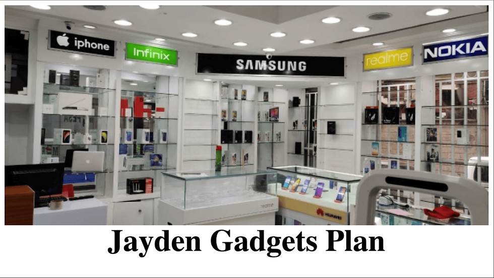
Before: The title "Jayden Gadgets Plan" centered on a plain white slide. That's it.
After: A full-bleed image of a premium gadget retail store interior — bright, aspirational, exactly the kind of space Jayden Gadgets is working toward. The Jayden Gadgets logo sits top left. A bold navy bar anchors the bottom third of the slide with "Business Plan 2026" in heavy white type. One slide, and the reader already knows this is a serious business.

The design decision here was deliberate: open with the dream, not the title. Show the investor what they're being invited into before you say a word.
Company Background
Before: Two paragraphs of dense text followed by a five-item bullet list. Readable, but forgettable. Nothing to anchor the eye.
After: The text is split across a two-column layout — narrative on the left, a real photograph from a Jayden Limited activation on the right. The bullet points are replaced with bold-label callouts. A branded capability block sits at the bottom in navy, making the key strengths impossible to miss.
The content didn't change. But now a reader scanning for thirty seconds walks away knowing exactly who Jayden Limited is and why it matters.


Relevant Industry Experience
Before: A paragraph of context followed by five lines listing brand partnerships in a basic table format.
After: Each brand — Samsung, Safaricom, Tecno, Infinix, OPPO — is listed in bold red type as a standalone label, with its corresponding activation description directly beneath. A real field activation photograph fills the right half of the slide. The Jayden website URL sits in a branded footer bar.
This is one of the strongest slides in the deck because it's essentially a client list — and client lists need to land with impact. The redesign makes each brand name feel like an achievement rather than a footnote.


Strategic Advantage
Before: Five bullet points explaining why Jayden Gadgets has an edge over competitors. Compelling argument, invisible presentation.
After: The headline becomes a bold two-line statement — "Strategic Advantage: From Activation to Retail Conversion" — in contrasting navy and red type. Each advantage becomes a standalone paragraph with a bold lead-in label. A product photography image of iPhones fills the left half, grounding the slide visually in the actual product category.
One specific detail worth noting: the original slide included a note to "use actual data from past campaigns" next to the 1,000,000 monthly reach figure. We kept that figure prominent and displayed it as a stat rather than burying it in a bullet — because numbers at that scale deserve to be seen.


Competitive Matrix
Before: A plain text table. White background, no header styling, no visual differentiation between rows.
After: The table structure was kept — it's the right format for this information — but redesigned with a bold red header row, alternating row weights for scannability, and tight column spacing. Five competitive dimensions are now easy to compare at a glance: Brand Recognition, Customer Insight, Supplier Access, Demo Experience, and Marketing Capability. Jayden's advantages are immediately clear without the reader having to hunt for them.
This is a slide that often gets rushed in business plans. But a well-designed competitive matrix is one of the most persuasive slides in any investor deck — it shows you understand the landscape and have thought carefully about where you fit in it.


Business Concept
Before: A short description paragraph followed by three nested bullet lists for product categories.
After: Three visual product tiles — Smartphones, Laptops, Gaming Devices — each with a category photograph, a bold red category label, and a clean list of specific models beneath. The descriptive paragraph moves to the left column. The layout communicates breadth and range without overwhelming the reader.
The redesign here solves a specific problem: nested bullet lists make product ranges feel like inventory. Visual tiles make them feel like a curated offering.


Revenue Streams
Before: Five bullet points. Device Sales, Accessories, Repairs, Trade-ins, Corporate Supply — all listed with short descriptions.
After: Five branded tiles arranged in a grid — two on top, three on bottom. Each tile has a category icon, a bold title, and a one-sentence description. Two of the tiles use the brand's navy and red fills to create visual emphasis. The same five revenue streams now read like a business model, not a shopping list.


Marketing Strategy
Before: Three sections — Digital Marketing, Experiential Campaigns, Influencer Partnerships — each with bullet sub-items. Standard structure, no visual weight.
After: Each section gets a bold red heading, a branded circular icon, and a clean two-column sub-list where needed. Real photography from Jayden Limited activations fills the left half of the slide — proof of capability, not just a claim of it.
This matters because marketing strategy slides are where many business plans lose credibility. Anyone can write "Instagram, TikTok, WhatsApp Business" in a bullet list. Showing real activation photographs while making that claim turns a statement into evidence.


What Business Plan Design Actually Changes
The content in both versions is identical. Every fact, every figure, every strategic argument — unchanged. What changed was the signal the deck sends before anyone reads a single word.
The original PPTX communicated: here is some information I have organised.
The redesigned PDF communicates: here is a business I have built in my mind, and I am ready to build it in the world.
That shift — from document to declaration — is what proposal design actually does. It's not decoration. It's the difference between a plan that gets read and a plan that gets funded.
The Takeaway for Your Business
If you have a business plan, marketing proposal, pitch deck, or company profile sitting on your desktop in a plain template — ask yourself honestly: does it look as good as the idea inside it?
If the answer is no, that gap is costing you. Not because investors and partners are shallow, but because first impressions are fast and ruthless. In the thirty seconds before someone decides whether to keep reading, design is doing the talking.
We can fix that. In 48 hours, with your content and our design, your deck will say what it was always meant to say.



Comments